
This is the third post in a series on how to make your own React UI Library.
What are we going to do?
- Add support for CSS Modules compilation to our builder.
- Add support for CSS Modules in Storybook.
- Enhance the styles of our UI components similar to what you would do in a design system.
CSS Modules
CSS Modules are great because they let you consume CSS in your components with locally scoped, auto-generated classes. This is useful for preventing collisions between classes.
Let's start by adding rollup-plugin-postcss:
lerna add rollup-plugin-postcss --scope=@cddev/phoenix-builderNow it is just a matter of importing the plugin and using it on the input configuration with the modules: true option.
phoenix-builder/lib/phoenix-builder.js
// At the top after other imports
const postcss = require('rollup-plugin-postcss');

// Adding a new plugin with modules: true
const inputOptions = {
  // ... other options
  plugins: [
    postcss({
      // Key configuration
      modules: true,
    }),
    // ... after other options
  ],
};
Let's add some CSS in phoenix-button to test this feature.
First create a styles.css next to phoenix-button.js:
phoenix-button/lib/styles.css
.Button {
  background-color: red;
}
After this you should be able to import it in your button and use it:
phoenix-button/lib/phoenix-button.js
import React from 'react';
import styles from './styles.css';

const Button = ({ children }) => (
  <button className={styles.Button}>{children}</button>
);

export { Button };
As you can see, to use CSS Modules you import the styles and access the class through the styles object, as if the class became a property of it.
Running npm run build should compile the component as before, adding new code to inject the CSS.
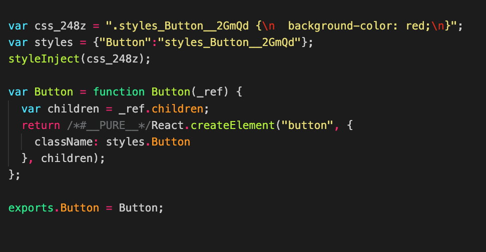
Add support for CSS Modules in Storybook
We cannot proceed without looking at what we are doing with styles. Simply importing CSS on the components and Storybook will not work, so we need to add CSS Modules support to Storybook.
Luckily, we have almost everything set up. We just need a small override on the Storybook webpack configuration in .storybook/main.js:
module.exports = {
  stories: ['../packages/**/*.stories.js'],
  addons: ['@storybook/addon-actions', '@storybook/addon-links'],
  webpackFinal: async (config) => {
    // Remove the default CSS rule from Storybook
    config.module.rules = config.module.rules.filter(
      (rule) => rule.test.toString() !== '/\\.css$/',
    );

    config.module.rules.push({
      test: /\.css$/,
      use: [
        'style-loader',
        {
          loader: 'css-loader',
          options: {
            modules: true,
          },
        },
      ],
    });

    return config;
  },
};
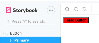
Voila! Now you can run npm run storybook and see your first React component using CSS Modules.
Enhancing the Button Component
This guide would not be complete without adding some fanciness. In this case, we are borrowing a few styles from Coinbase, because why not?
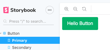
From their homepage we can see they have mainly two buttons: one green and one with a white outline. Let's create CSS for those.
phoenix-button/lib/styles.css
.Button {
  background-color: #05b169;
  border-radius: 0.25rem;
  border: 1px solid #05b169;
  color: #fff;
  cursor: pointer;
  font-size: 1rem;
  padding: 0.75rem 1rem;
  transition: all 100ms ease-in-out;
  width: auto;
  outline: none;
}

.Button:hover,
.Button:focus {
  background-color: #00a55e;
  border-color: #00a55e;
}

.ButtonSecondary {
  background: transparent;
  border-color: #fff;
}

.ButtonSecondary:hover,
.ButtonSecondary:focus {
  background: #fff;
  border-color: #fff;
  color: #000;
}
Now for the code in the button:
phoenix-button/lib/phoenix-button.js
import React from 'react';
import cx from 'clsx';
import styles from './styles.css';

const Button = ({ children, className, variant, ...rest }) => {
  const classes = cx(
    styles.Button,
    {
      [styles.ButtonSecondary]: variant === 'secondary',
    },
    className,
  );

  return (
    <button {...rest} className={classes}>
      {children}
    </button>
  );
};

export { Button };
Enhance the stories like this:
phoenix-button/docs/phoenix-button.stories.js
import React from 'react';
import { Button } from '../lib/phoenix-button';

export default { title: 'Button' };

export const primary = () => <Button>Hello Button</Button>;

export const secondary = () => (
  <div style={{ background: '#1652f0', padding: 12 }}>
    <Button variant="secondary">Hello Button</Button>
  </div>
);
Now you should be able to see some variants of your fancy button:

Enhancing the Text Component
We are just going to grab a couple of sizes in the type stack and not use a proprietary font.
phoenix-text/lib/styles.css
.Text {
  font-family: -apple-system, BlinkMacSystemFont, 'Segoe UI', Roboto, Oxygen,
    Ubuntu, Cantarell, 'Fira Sans', 'Droid Sans', 'Helvetica Neue', sans-serif;
  font-size: 0.875rem;
  font-weight: 400;
  line-height: 1.5;
}

.Hero {
  font-size: 3rem;
  font-weight: 800;
  line-height: 3.25rem;
}

.Heading {
  font-size: 2.5rem;
  font-weight: 500;
}
phoenix-text/lib/phoenix-text.js
import React from 'react';
import cx from 'clsx';
import styles from './styles.css';

const Text = ({ children, className, as = 'p', variant, ...rest }) => {
  const textVariant = styles[variant] || styles.Body;
  const classes = cx(
    styles.Text,
    {
      [textVariant]: variant,
    },
    className,
  );

  return React.createElement(as, { ...rest, className: classes }, children);
};

export { Text };
phoenix-text/lib/phoenix-text.stories.js
import React from 'react';
import { Text } from '../lib/phoenix-text';

export default { title: 'Text' };

export const Body = () => <Text>Body Text</Text>;
export const Hero = () => <Text variant="Hero">Hero Text</Text>;
export const Heading = () => <Text variant="Heading">Heading Text</Text>;
Conclusion
You now have CSS Modules support both for your compiled code and Storybook. This makes collisions less likely through auto-generated classes, and you can go one step further by providing source code so clients can compile the code and generate the classes and styles themselves.