

This is the second post in a series on how to make your own React UI Library.
What are we going to do?
- Add Storybook support for our project.
- Add a couple of stories using our components.
- Wire up a task for static documentation generation and pushing it to GitHub Pages as a demo.
Storybook
Storybook is a great tool to document and test React components. It is easy to get started, and it can serve as a kitchen sink for experimenting with components.
We are going to run the Storybook CLI to get the project started using --type react since our library is made in React.
npx -p @storybook/cli sb init --type reactAfter this you should see a folder structure like this:
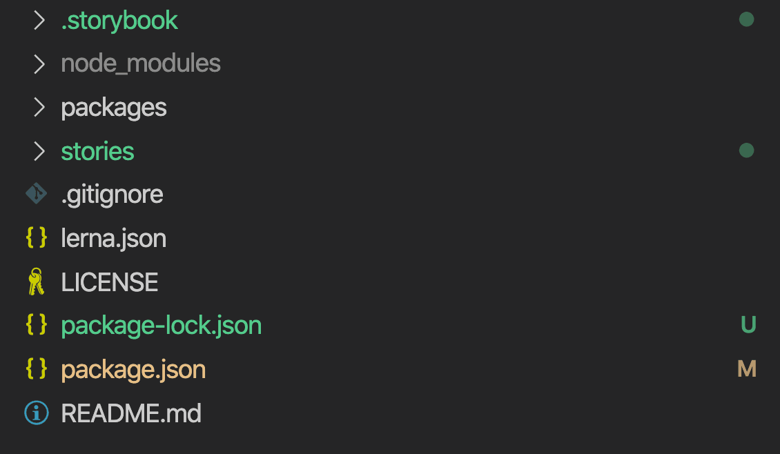
We are going to co-locate the stories along with the components, so let's get rid of that stories folder.
rm -rf stories/Now let's open .storybook/main.js and edit the pattern matches so Storybook can look for stories within our packages.
.storybook/main.js
module.exports = {
  stories: ['../packages/**/*.stories.js'],
  addons: ['@storybook/addon-actions', '@storybook/addon-links'],
};
Writing our first story
Let's write our first story for phoenix-button!
I recommend creating a docs folder so you can co-locate related documentation for the component.
Create a phoenix-button.stories.js file inside docs as shown in the picture below:
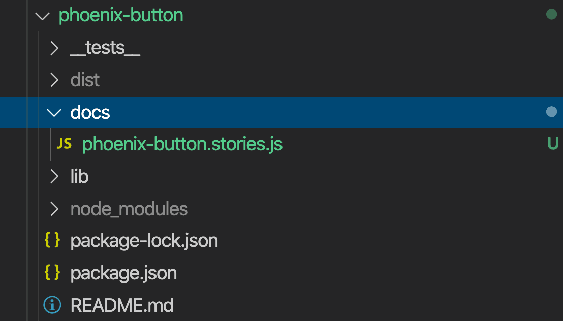
phoenix-button/docs/phoenix-button.stories.js
import React from 'react';
// We want to always get from source
import { Button } from '../lib/phoenix-button';

export default { title: 'Button' };

export const primary = () => <Button>Hello Button</Button>;
Let's do the same for phoenix-text:
phoenix-text/docs/phoenix-text.stories.js
import React from 'react';
// We want to always get from source
import { Text } from '../lib/phoenix-text';

export default { title: 'Text' };

export const small = () => <Text>Hello Text</Text>;
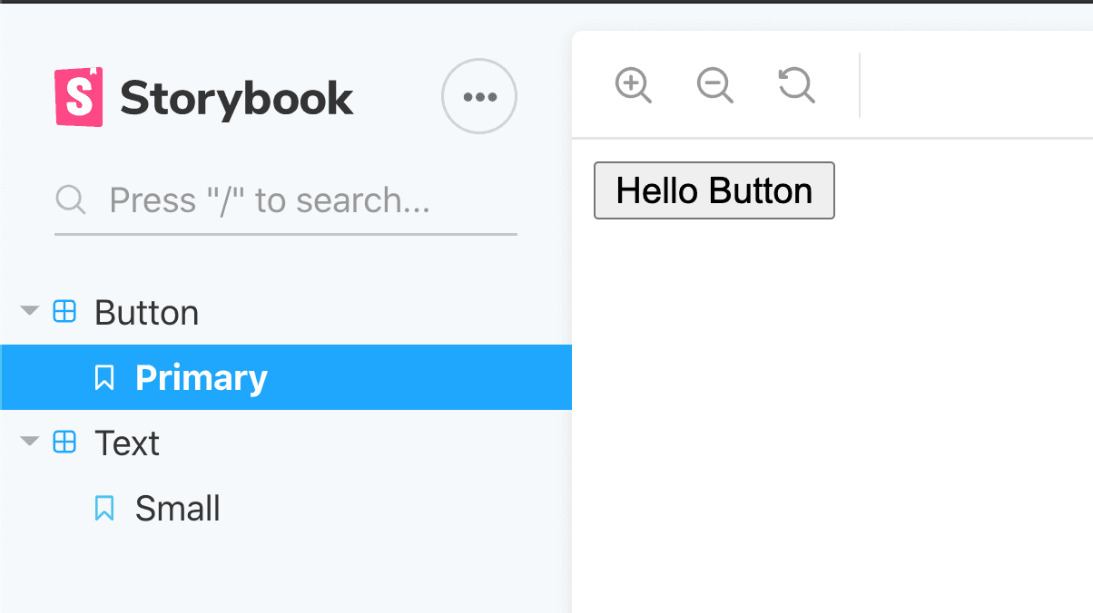
After this, run Storybook and you should see your two components rendered in Storybook! 🎉
npm run storybookThe display:

Making a demo site in GitHub
We want to have a demo site for testing and sharing with clients. Fortunately, GitHub has a feature called GitHub Pages that can help us with this.
If you already started this tutorial from a fresh repository on GitHub, you can skip the next few paragraphs. If you did not, follow this guide to create a new repository.
# Let's initialize the repo
git init
# Add the remote pointing to your origin
git remote add origin <your-origin>
# Create a gitignore to untrack node_modules
echo "node_modules" > .gitignore
# Add all files
git add .
# Commit
git commit -m "feat: add initial structure for UI Library"
# Push
git push -u origin master
gh-pages to the rescue
To push our site to GitHub Pages we are going to use a small npm module called gh-pages.
Let's install it in our project:
npm i --save-dev gh-pagesNow we need to create a script to do this; we will name it deploy.
deploy should build Storybook first and then run gh-pages over the generated folder. By default Storybook creates a storybook-static folder that we can use.
"scripts": {
  "build": "lerna run build",
  "test": "echo \"Error: no test specified\" && exit 1",
  "storybook": "start-storybook -p 6006",
  "build-storybook": "build-storybook",
  "deploy": "npm run build-storybook && gh-pages -d storybook-static"
}
After running:
npm run deployIn your repository settings in GitHub you can find a URL for the demo site that looks like this:
https://davixyz.github.io/phoenix-part2
Conclusion
We bootstrapped a documentation and kitchen-sink site to test our React components. Storybook makes it easy to get started, and GitHub Pages gives us a mechanism to share the static build with external clients.